
Customise small multiples in Power BI
easily compare different categories on the same axes

Data consultant enthusiastic about creating insightful and aesthetically pleasing reports. Writes about Power BI and anything data related.
What are small multiples?
Small multiples allow the user to easily compare different visuals on the same scale and axes. It allows you view trends within your data across different categories.
Consider a scenario: You're the sales team manager
You would like to see how much money each sales rep brings in across different product categories on a monthly basis.
There are a number of ways this can be visualised.
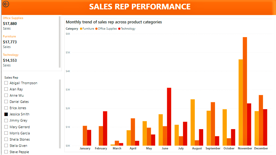
- Clustered column
This is a common favourite for visualisations but I'm sure you'd agree that it's difficult to quickly deduce the trend across each product category.
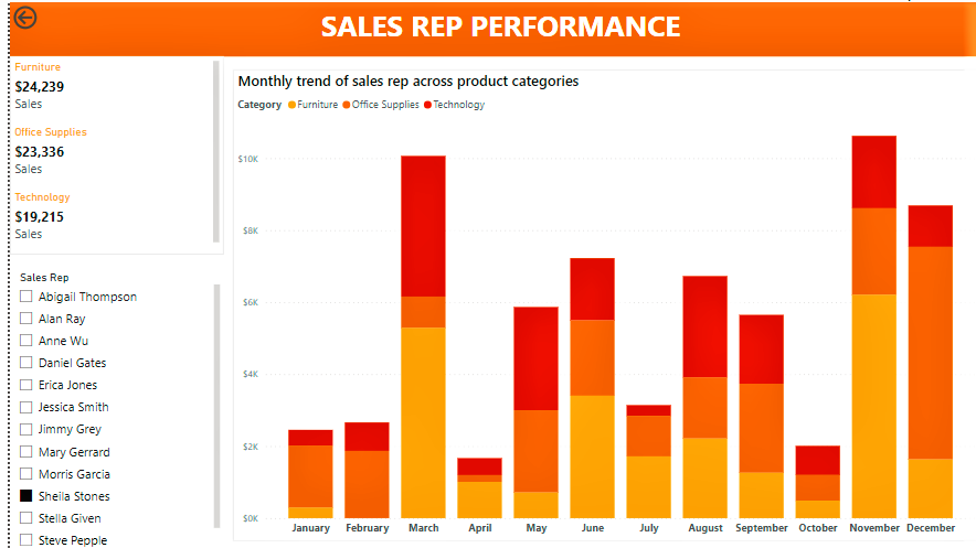
- Stacked column chart
This is an improvement on the previous visual, and shows the share of sales from each product in the sales total each month.
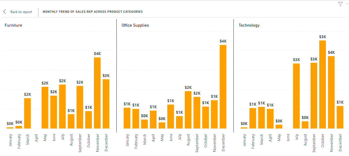
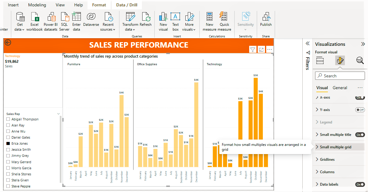
- Small Multiples
Here we can see the visual has been broken into partitions with each one showing trends for each product category.
How to add small multiples to a visual
To create the clustered and stacked column charts seen previously, our visualisation pane would look like so
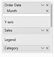
Scrolling a bit further down, you'll see the field for small multiples
- In the visualisation pane, place the category you would like to partition your data on in the small multiples field.
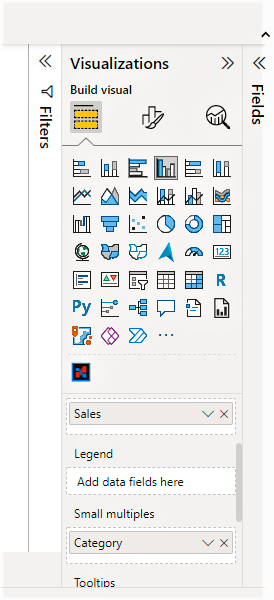
- the small multiples grid is customisable to your preference. you can select the number of rows and columns you would like displayed under the format tab of the visual.
That's it! it's pretty straight forward.
now, let's take it a step further.
Customise small multiples with different colours
The default setting for small multiples is that the columns in all your partitions are the same colour. What if you'd like to retain the colour setting we saw earlier with the stacked column chart?
here's how to do it
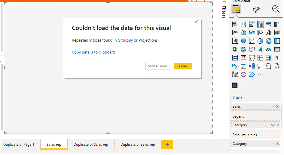
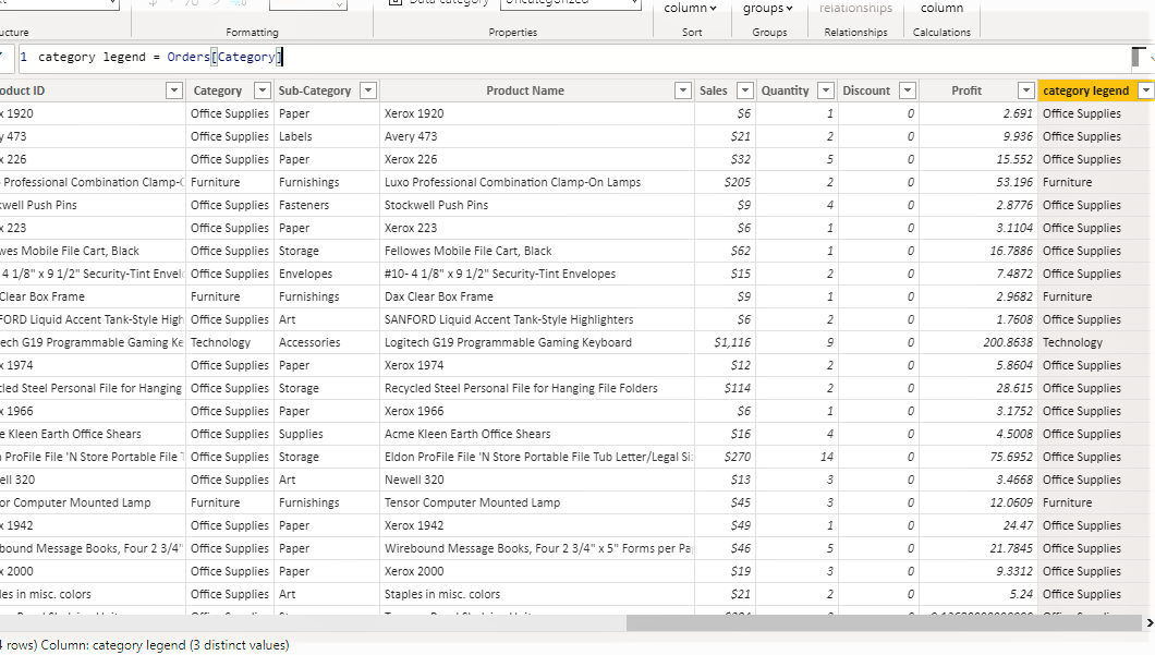
- Create a new column in your table which is a duplicate of your category column. We need to do this because we can not use the same column as a Small Multiple category and as a Legend at the same time.
If we tried it we'd run into this error
The DAX is simple, see an example below
category legend = Orders[Category]
In plain terms, we are creating a new column with the same data as in the Category column of the Orders table.
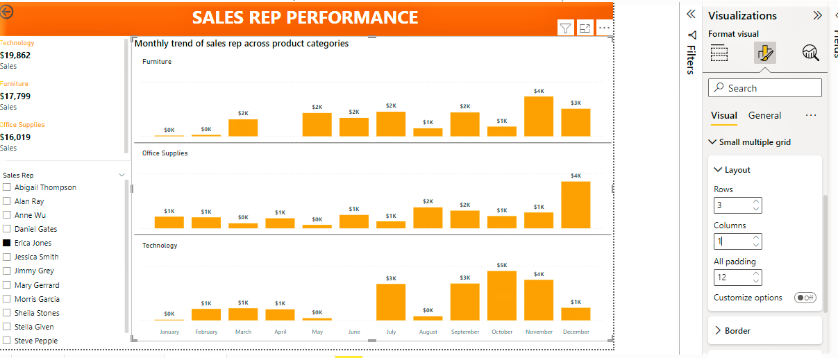
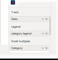
- Use the duplicated column as a legend in your image, this allows you to customise each partition with the colour of your choosing.
Voila
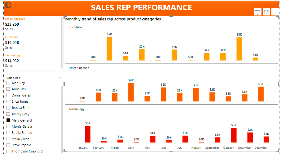
Now, at a glance, you can see how each sales rep is performing across different product categories.
Do you use small multiples? what do you think? Please share if you found this useful, and leave a comment if you have any :)
note: There is a small error in title of the visual, it should say "Monthly trend of sales across product categories"


