
How to create a custom visual in Power BI using Charticulator
Show full category text on Y-axis of a bar chart in Power BI

Data consultant enthusiastic about creating insightful and aesthetically pleasing reports. Writes about Power BI and anything data related.
Introduction to Charticulator
Charticulator is a visualisation tool that has recently become generally available as a custom visual in Power BI. It is a powerful tool which lets you fully customize various types of visuals.
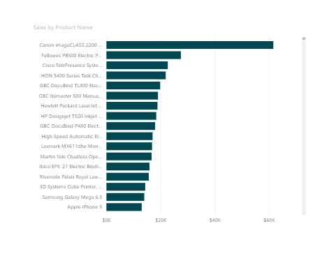
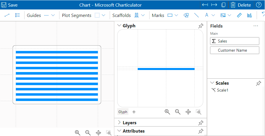
Today I'd like to show you how to solve a little annoying issue analysts face when using the default bar chart in Power BI. When displaying categories with long text on a Bar Chart, you have limited space and won't be able to display the full text for each category. See an example below
Today, I'm breaking down the steps to create a bar chart and show full texts on the Y-axis.
- Import charticulator
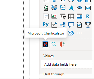
In the visualization pane, click the ellipses(...) and select get more visuals. Search for the Charticulator and import it into your report.
- Launch the charticulator canvas
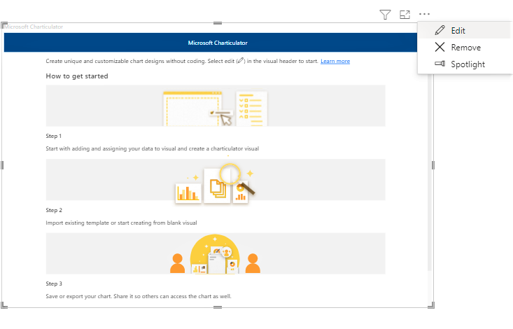
On the visual, click on edit to open on the charticulator canvas
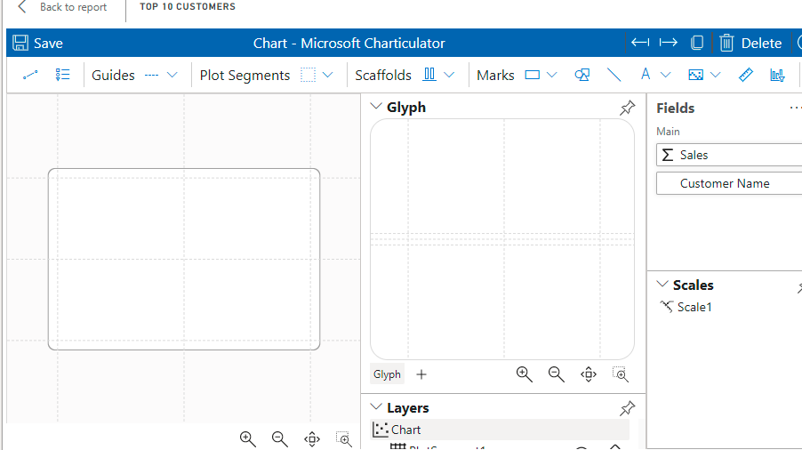
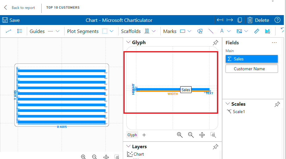
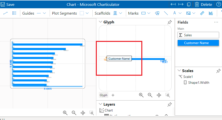
- Add the fields you'd like to visualise in the visualization pane
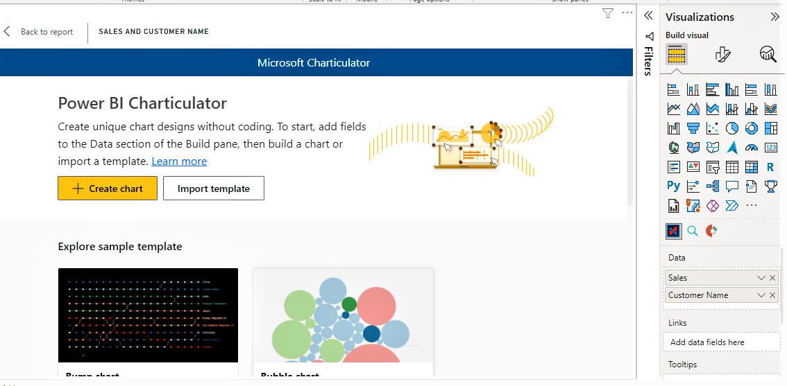
In the visualization pane, drag and drop the fields you would like to visualise. In my example below, I chose the Customer name and Sales columns.
Then select the Create Chart button
Important Terminology
A mark is a graphical element (e.g., rectangle, line, text).
A glyph is a visual representation of a single data row. A glyph contains one or more marks.
A plot segment lays out a set of glyphs.
I'd prefer not to duplicate efforts so please refer to the Getting Started with Charticulator guide for more details on chart elements.
- Create Bar chart in Charticulator
To create the bar chart we will need 3 things
- Mark - A rectangle for the bar share
- A text for the Name of the Customer
- A text to display the total sales amount for each customer.
These 3 items will be configured directly on the glyph and will display on the visual.
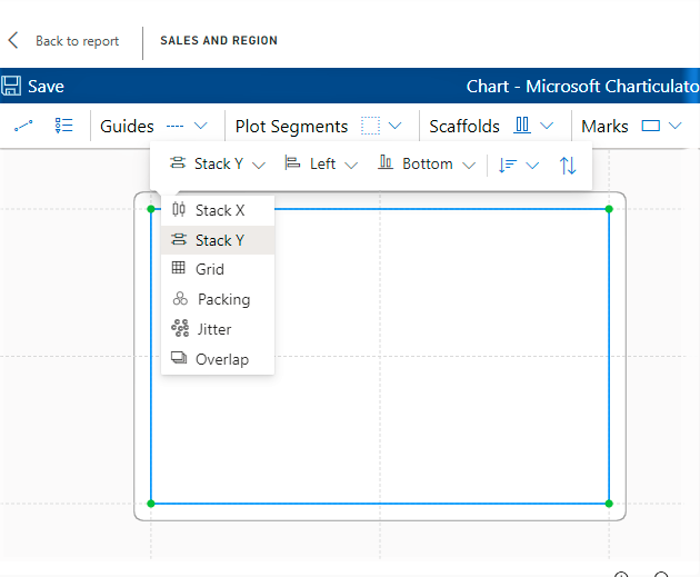
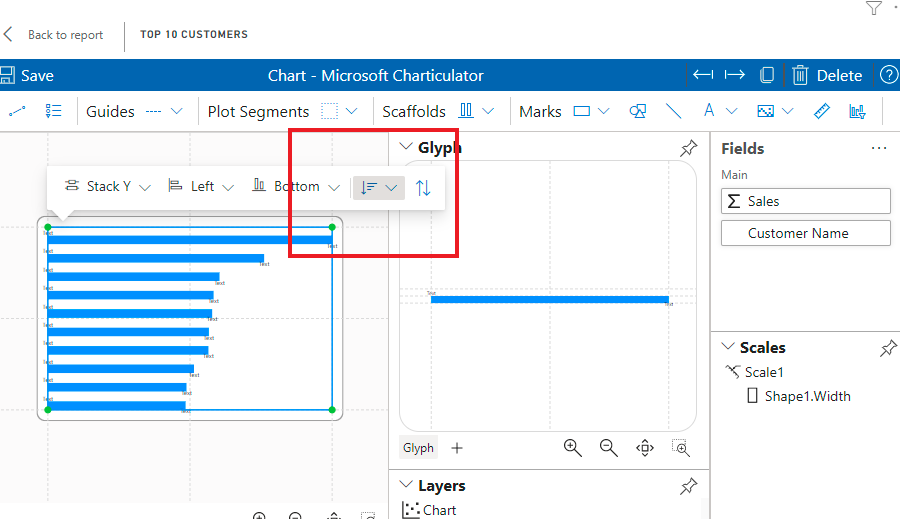
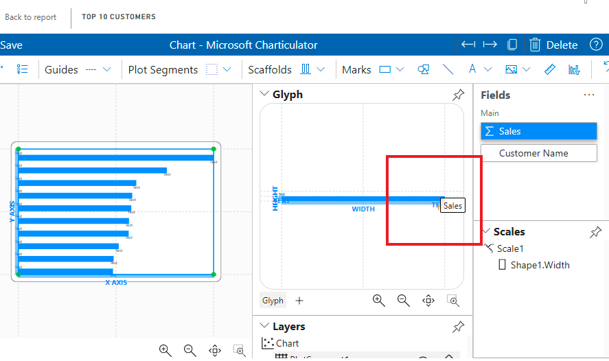
Step 1: Configure the chart axis
Click on the visual in the main canvas to open up a menu, select Stack Y. We're selecting this because we would like a Bar Chart with vertical orientation. Stack X would give us Column charts.
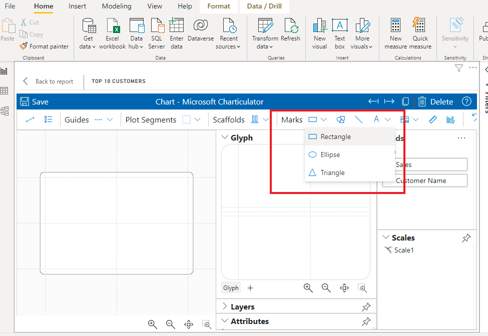
Step 2: Create the bar
Select rectangle
Click on the drop down arrow beside mark and select rectangle
- Draw the rectangle on the bottom half of the grid lines in the glyph
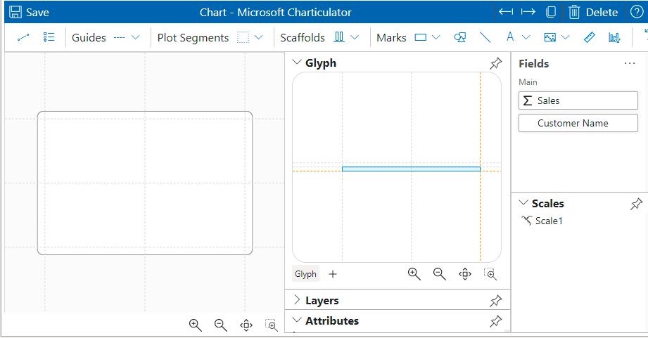
- Drag and drop the sales field to the bottom of the rectangle to determine the width of the rectangle. The aspect you are formatting turns orange when it is aligned.
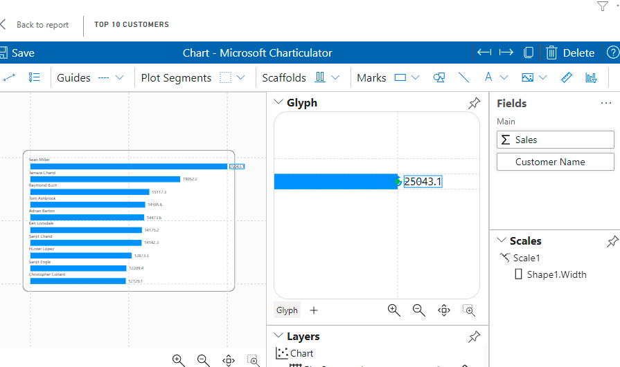
- Click on the visual to sort the bars in descending order
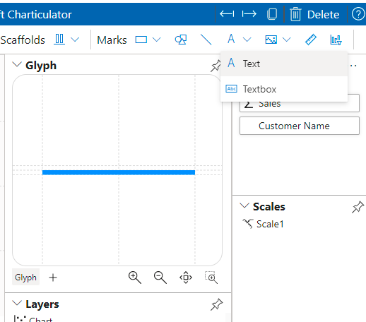
Step 3: Add text to the glyph
- Select text from items menu
Drag and drop a text at the top of the glyph and another on the right end of the rectangle.
Drag the customer name to the text on top on the rectangle
- Drag the sales amount to the text to the right of the rectangle
- You can zoom in on the glyph to place the text anywhere on the glyph
Step 4: Customise the Glyph
You can change the colours, fonts, positioning, formatting and much more using the Layers and Attributes tabs.
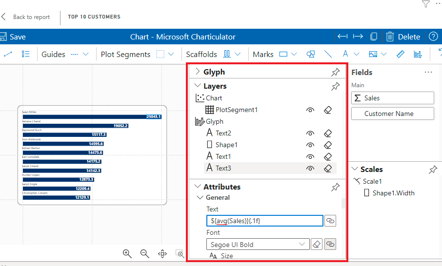
The Layers details each design element you have placed on your glyph. The shape for the bar as well as the text elements you have put in. To edit a specific aspect, select it in the Layers tab.
To edit a selected element, you change the details in the Attributes tab. In the image above, the data label is formatted to 1 decimal place. However I wanted it to show me the figure in thousands.
I changed the number format from {.1f} to {.2s}
More info: formatting in Carticulator
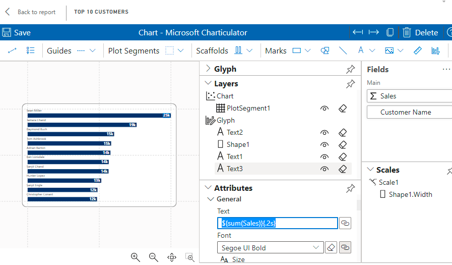
and changed the colour of the bar to a darker blue.
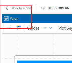
Step 5: Save your chart
When done formatting, Save the chart to effect changes
Here's our final chart
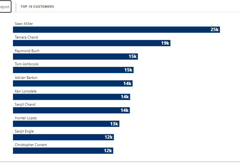
What do you think? I was really excited to discover this and hope it helps you improve your visuals in your reports.
Please share if you found this useful, and leave a comment if you have any :)
More of me:
Connect with me on LinkedIn
View my Portfolio


