
Visualise Nigerian data using maps in Power BI
Accurately map states using longitude and Latitude values

Data consultant enthusiastic about creating insightful and aesthetically pleasing reports. Writes about Power BI and anything data related.
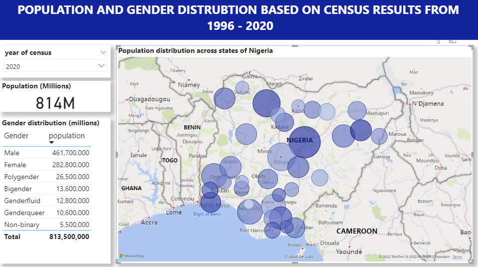 Gender and population distribution across states in Nigeria.
The report above shows population distribution across Nigerian states based on results from sample census data. I generated the data using one of my favourite data resources mockaroo.com.
An issue that can come up when trying to visualise data using maps in Power BI is certain regions (outside the US & co) are not accurately identified on the maps. This can lead to the misrepresentation of states as in the examples below.
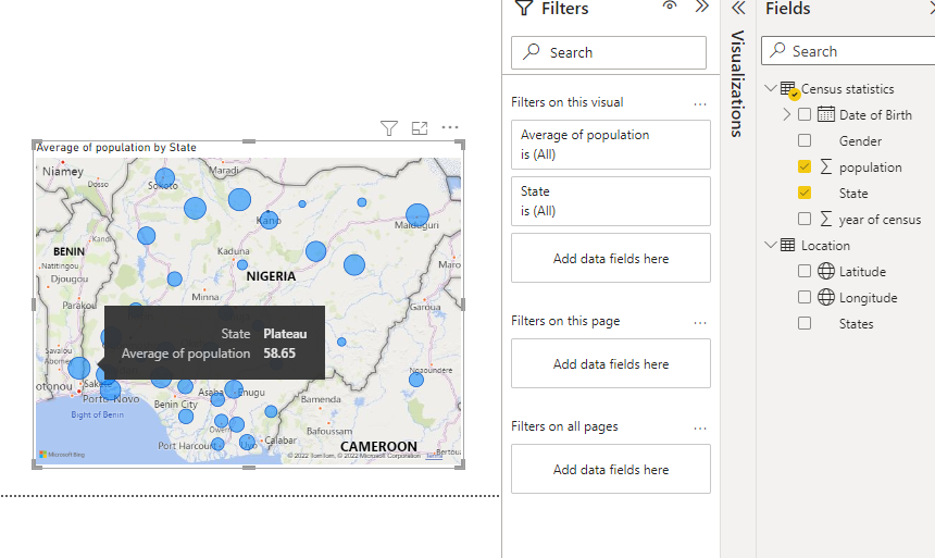
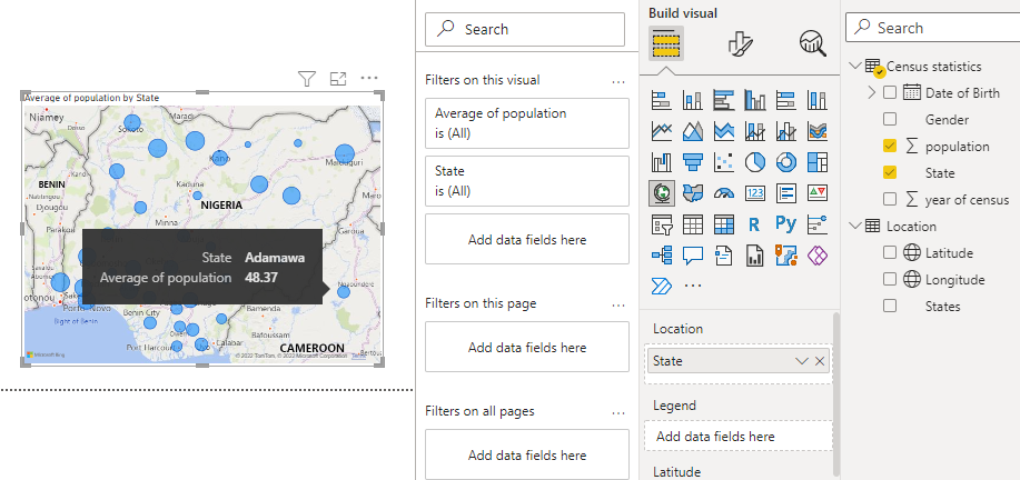
You can see from the images that Adamawa is appearing all the way in Cameroon and Plateau state is appearing in the South-West of Nigeria.
This can be fixed by adding the longitude and latitude of each state to your Power BI model. Here's a table you can download with each State and its corresponding longitude and latitude values.
To add this to your report
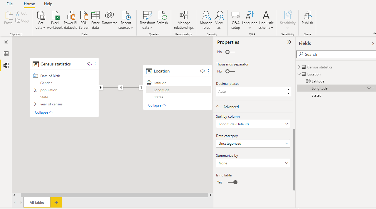
Step 1: Import the table into Power BI Desktop and create a relationship between the "States" Columns in your main table and the new table.
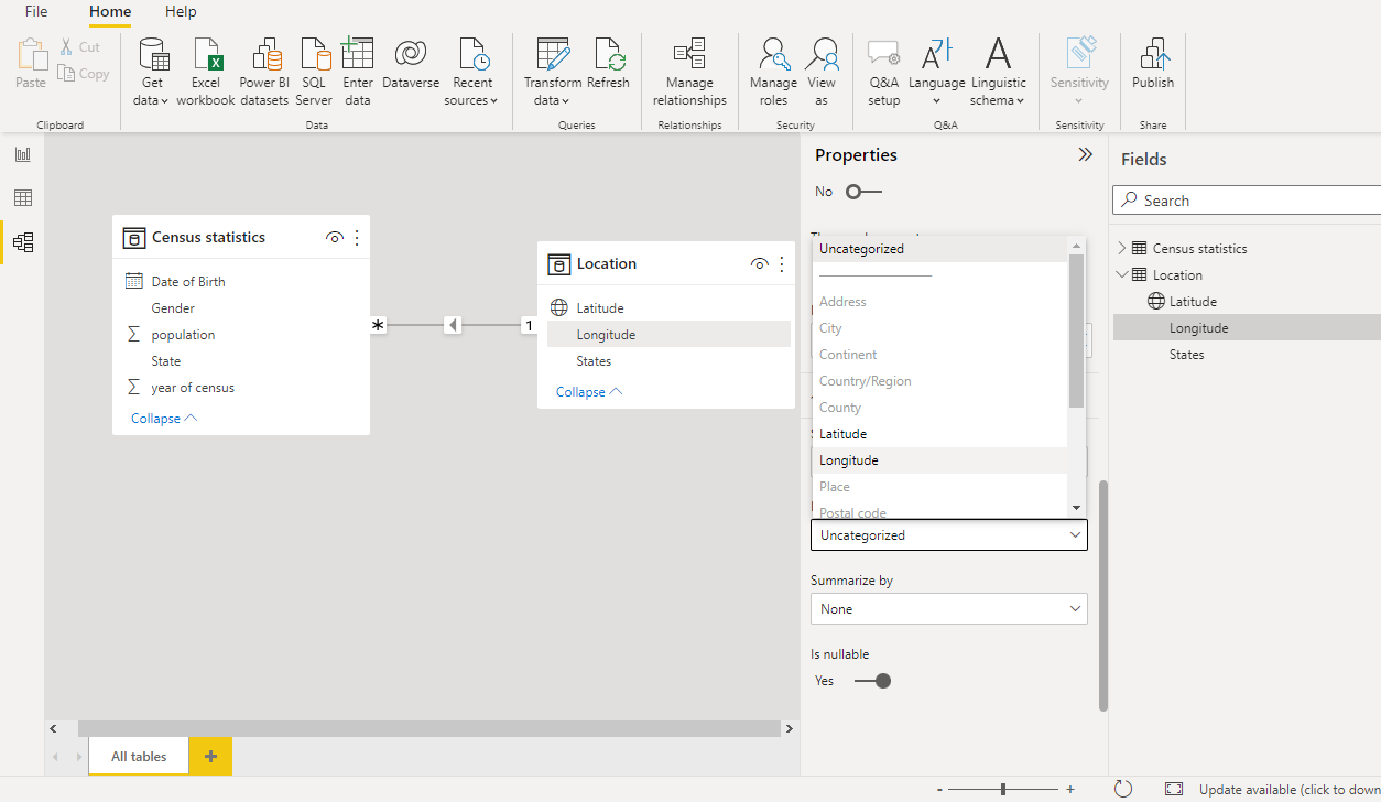
Step 2: In the model view. Go to Field > Select the column (i.e. longitude) > Properties > Advanced > Data Category
Under the options select the appropriate data category, in this instance I selected longitude. notice the globe icon that appears beside the column name. This identifies it as a geographical location.
Step 3:
In the report view, select the Map visual then place the longitude and latitude fields in their respective spaces.
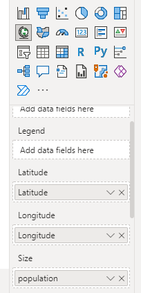
and voila! you will have an accurate map visual.
Please share if you found this useful, and leave a comment if you have any.


