
4 Custom visuals to use in Power BI to improve data visualization

Data consultant enthusiastic about creating insightful and aesthetically pleasing reports. Writes about Power BI and anything data related.
There are about 40 default (out-of-the box) visuals available for use in Power BI reports.
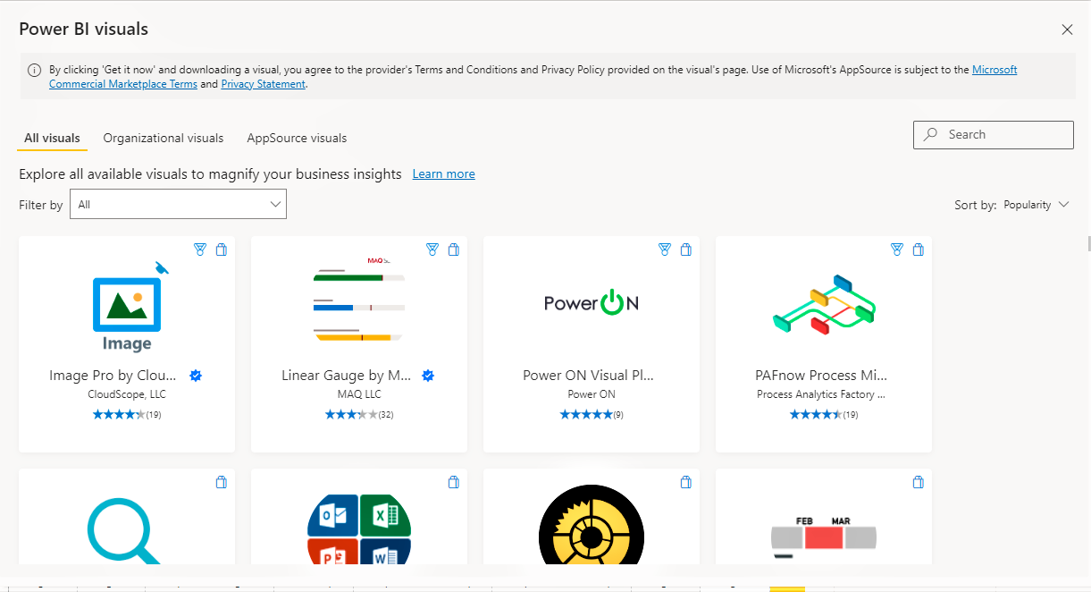
There are more custom visuals available in the Microsoft Appsource and Power BI that have been created by Microsoft or Microsoft partners. These have been tested and approved by Microsoft and can really take your visuals to the next level.
Here are my top 4 for enhancing reports
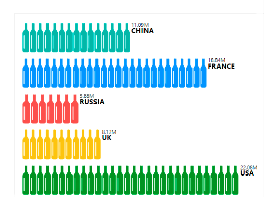
1. Infographic designer

The Infographic designer allows to customise the appearance of charts using colours, icons, and different fill options.
here's an example of a visual you can create using the designer.
 Source: Microsoft Power BI
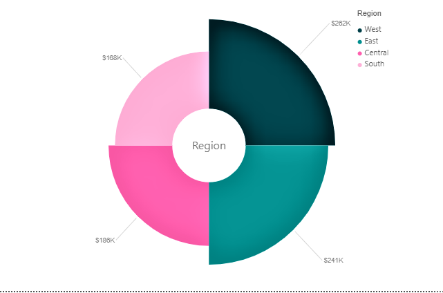
2. Aster Plot
Aster plots are a step up from your regular Pie chart, it also illustrates numerical proportions but goes out of the neat borders of a normal circle. Here's an example of an Aster Plot showing the share of product sales across regions
3. Tachometer
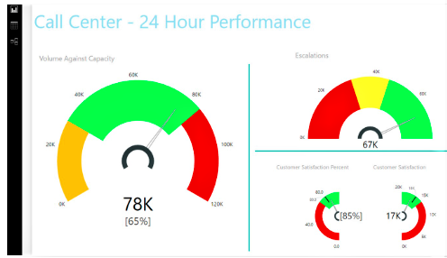
This is a customisable gauge which can be edited to change the section widths, axis, colour ranges and much more. It is useful for monitoring the performance across specified ranges.
Here's an example of what you can do with the tachometer
 source: Microsoft Power BI
4. Charticulator
The charticulator is a very powerful visualisation tool that allows you to fully customise and design complex visualitsations. My current favourite use case is being able to show full text on the Y-Axis of Bar charts. Here's an example
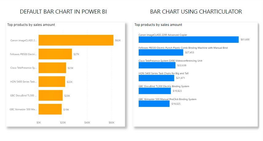
The default bar chart in Power BI can be a bit annoying to use when you're trying to show full category names on the Y-axis. If you'd like to know how to achieve this using the charticulator visual, I have a blog post about it here
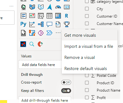
To access the store to import any of the custom visuals into your report, select the ellipsis in the visualiszation pane and select get more visuals
Have you tried any of these out? What are some of your favourite visuals to use in your reports? Let me know in the comments.
P.S: I generally prefer to use Power BI certified visuals. These are visuals in AppSource that meet the Microsoft Power BI team code requirements. These visuals are tested to verify that they don't access external services or resources, and that they follow secure coding patterns and guidelines.
Thanks for reading, please share if you found this useful! :)
Connect with me on LinkedIn:Kiite Koiki


