
Conditional formatting with thresholds in Power BI

Data consultant enthusiastic about creating insightful and aesthetically pleasing reports. Writes about Power BI and anything data related.
Conditional formatting is an easy way to highlight values so report users can receive quick insights on the status of key metrics. In this post, I will be showing a way to apply dynamic conditional formatting on visuals with set thresholds. This will involve using the SWITCH() statement in measures written in DAX.
Scenario
We run a fulfilment company and one of the KPIs we track is the number of days it takes us to ship orders after the order is made. A sample threshold example is for Standard shipping. Our target is keep the days below 5, it's kind of okay if it's 6 but definitely has negative impact on customer experience if it takes longer than 6 days.
We'd like to set this up in a Power BI report using visuals which changes based on this threshold. How do we translate this into a DAX measure? Using a lovely function called SWITCH(True())
The SWITCH() Statement
The SWITCH function evaluates an expression and checks if the values in that expression match values specified and returns required results. To use this to check if a value truly matches, we use the True() function (this returns True or False). The functions together work in a similar way to the IF function. It checks if a condition is true and returns a result depending on whether it is true or false.
The syntax is as follows
SWITCH(<expression>, <value>, <result>[, <value>, <result>]…[, <else>])
Parameters:
Expression: Any DAX expression that returns a single scalar value, where the expression is to be evaluated multiple times (for each row/context).
Value: A constant value to be matched with the results of expression.
Result: Any scalar expression to be evaluated if the results of expression match the corresponding value.
else: Any scalar expression to be evaluated if the result of expression doesn't match any of the value arguments.
Expressing this in another way, including the True() function, it would look like this
SWITCH(True(),
First thing to check, Result if first thing is true,
 Second thing to check, Result if second thing is true, ...)
If it's a bit confusing then maybe it will become clearer when you see it used in context.
Implementing the Switch Statement for the conditional format
So we know our KPI threshold for standard shipping levels, the measure for that goes as follows
Std shipping col =
SWITCH(true(), [average days to ship] > 6, "RED",
     ([average days to ship] > 5 && [average days to ship] <= 6),  "#FFBF00",
       [average days to ship] < 5 "#58D72A")
What this "Std shipping col" does is
check if the Average days to ship is greater than 6 and if it is returns RED,
then checks if Average days to ship is between 5 and 6 and returns YELLOW,
and finally checks if the average is less than 5 and returns GREEN.
As we can see in the measure, we can use the specific colour HEX code or write the name of the colour. You may want to use the code so you can control the hue or shade of the colour you want to display.
Link the measure to the visuals
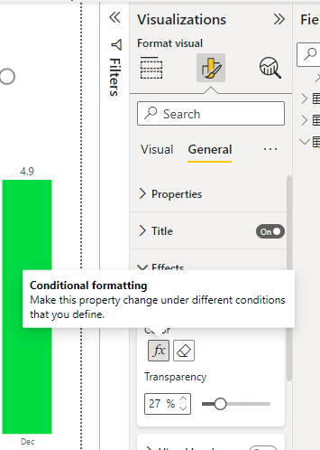
To set the conditional format, follow these steps
- Select the visual
Click on the format visual button in the visualizations pane
Click on the colour aspect you would like to change, this can be the background colour, fill colour, title background etc.
Click on the fx button
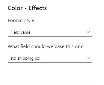
- Click on the field value in the drop down under format style
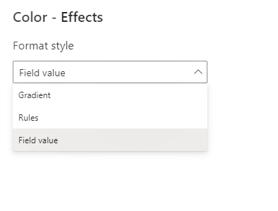
- Select the measure you created
Viola!
Test the formatting
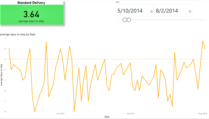
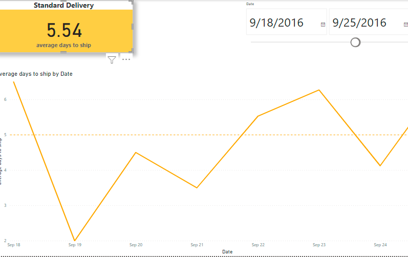
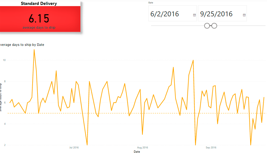
I created a report with 3 objects, a card showing the average value, a data slicer and a visual showing the trend of the average over time.
When the dates are between May and August 2014, the average is 3.64 so the background colour is green.
When filtered to a week in september, the average is 5.56 so the background colour is amber.
When the dates are between June and September 2016, the average is 6.15 so the background colour turned red.
Another use case
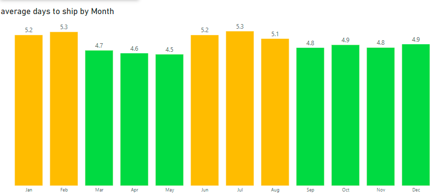
We can also apply conditional formatting to other visuals like Bar or Column charts.
Here's a visual that shows the average days to ship on a monthly basis. For each month, the colour of the column corresponds to the threshold.
Taking it a bit further with small multiples
If you're not familiar with small multiples, you can read my post on them here.
Say we wanted to display average ship days per month for each shipping mode in one visual, this can be done using another SWITCH statement to return the colour tailored to the threshold for each shipping mode.
A sample measure created for First Class would be similar to the one created for Standard shipping.
frst shipping col =
SWITCH(true(), [average days to ship] > 3,
     "RED",
     ([average days to ship] > 2 && [average days to ship] <= 3),
      "#FFBF00",
       [average days to ship] < 2,
      "#58D72A", "black")
The same version of this measure was created for Second Class and Same Day shipping. After these were set up, The SWITCH measure below was created to select or filter for specific ship modes.
Switch thru colours =

VAR SHIPMODE = SELECTEDVALUE(Orders[Ship Mode])

RETURN
SWITCH(SHIPMODE,
"Standard Class", [std shipping col],
"Second Class", [scd shipping col],
"First Class", [frst shipping col],
 "Same Day", [same day shipping col])
In the measure above, the switch statement evaluates against the expression defined by the variable called 'SHIPMODE'. It then returns the results from the corresponding measure for each ship mode. This makes it possible to customise the colours of each ship mode as seen in the image below
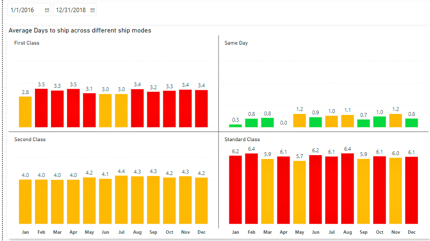
You can see from the visual that for First Class, its red when the average days to ship is above 3 days but yellow for Second Class.
That's it! hope you've found this post useful, Can you think of more instances where this could be applied?
Kindly share this post and leave a comment if you have any.
References


