
Field Parameters in Power BI
say good bye to bookmarks and selection panes

Data consultant enthusiastic about creating insightful and aesthetically pleasing reports. Writes about Power BI and anything data related.
Power BI's May update has created quite a buzz because of a new preview feature called Field Parameters
What's a Field parameter?
Field parameters let users change the categories and measures displayed on a visual. This addition saves report builders a lot of time as the way to do this prior to the update was to use bookmarks & calculation groups.
This feature is currently in preview, this means people can test it out in their reports but it will probably not work in the Power BI service. You can implement the feature in your reports when it is made generally available.
Let's see how it works!
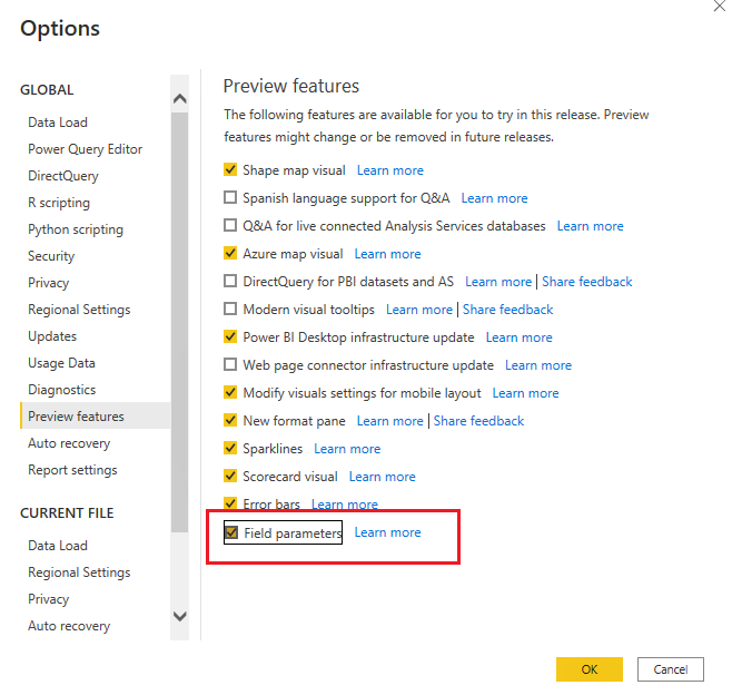
Enable the field parameter feature
Ensure you have the updated version of Power BI desktop.
In Power BI desktop go to file > the options & settings > options > preview features > select the Field Parameters checkbox
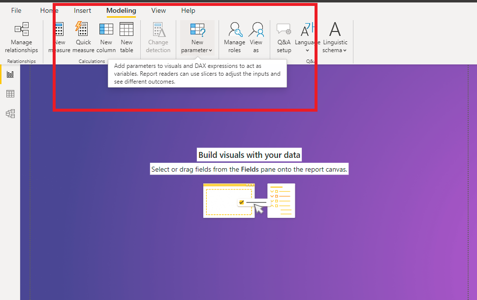
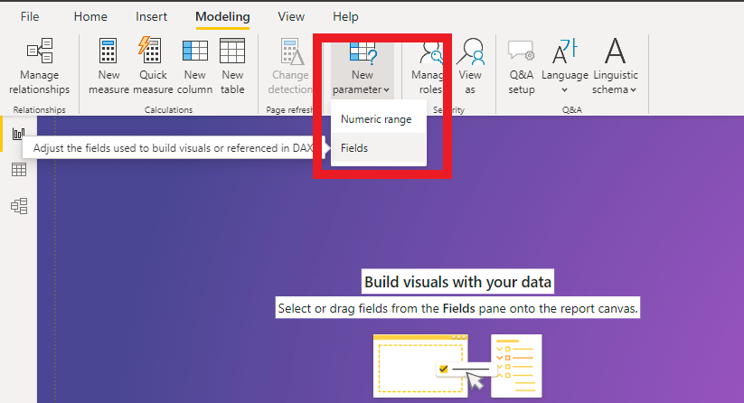
Create and update a field parameter
To create a new field parameter, in the modelling tab, select New parameter > Fields
This opens a window for you to select the fields for your parameter
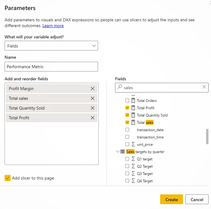
It auto generates a DAX measure you can use to edit the parameter
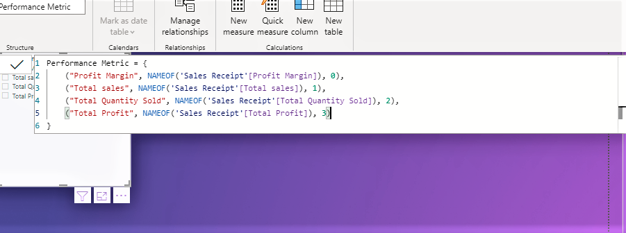
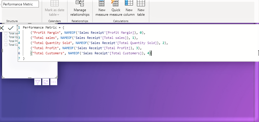
Say you wanted to add another category, you can edit the measures and add in another line in the same structure as the previous categories.
Use cases for field parameters
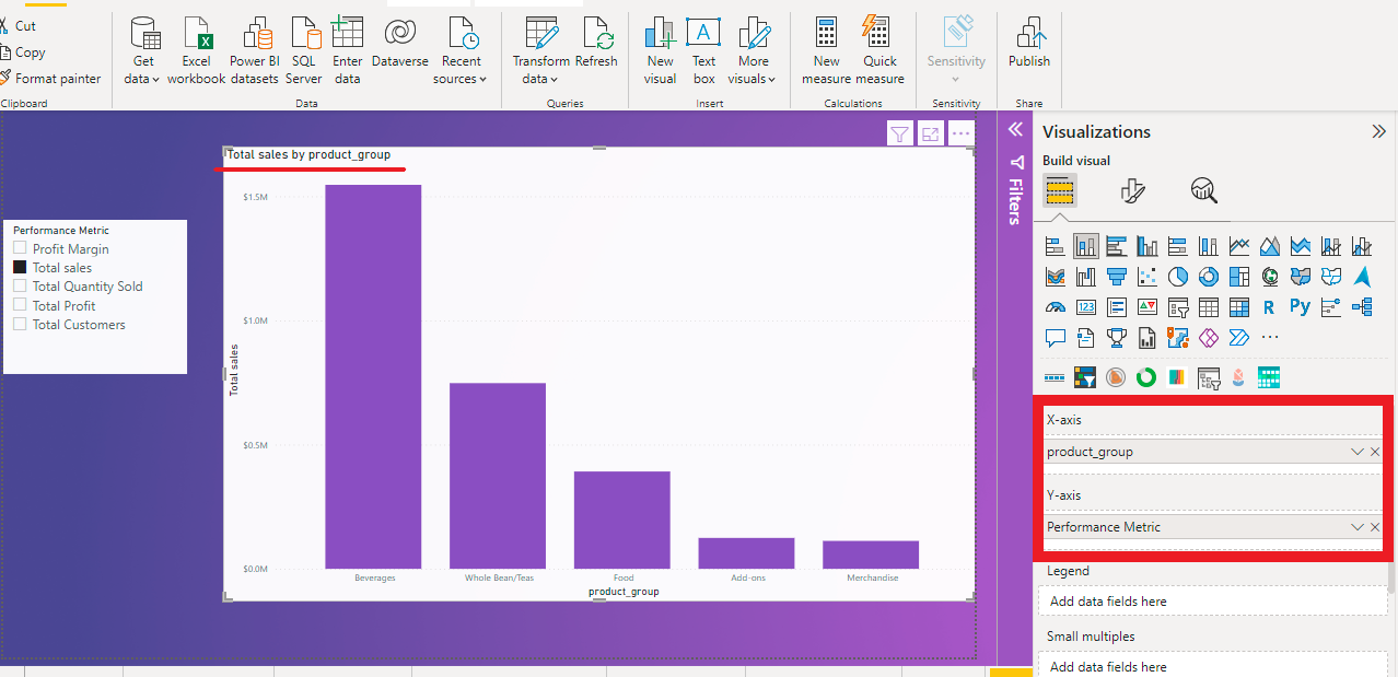
Creating a field parameter adds a slicer to the report page, You can use the parameter on the axis as you would any other field or measure.
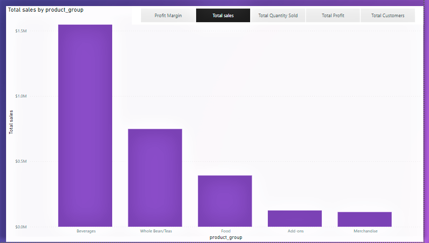
- Example 1: Using the field parameter on the axis
This visual shows the sales by each product group, notice the title aligns with the performance metric category chosen
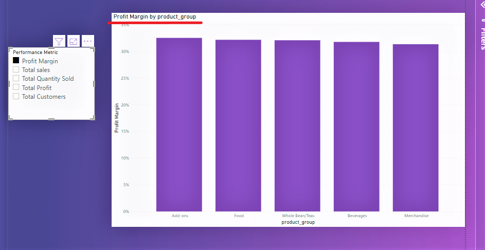
Selecting a different category will update the visual as seen below, The visual is now showing profit margin by product category & the title reflects the chosen value.
You can also customise the slicer. I changed the slicer from vertical to horizontal & and placed it in front of the visual like so
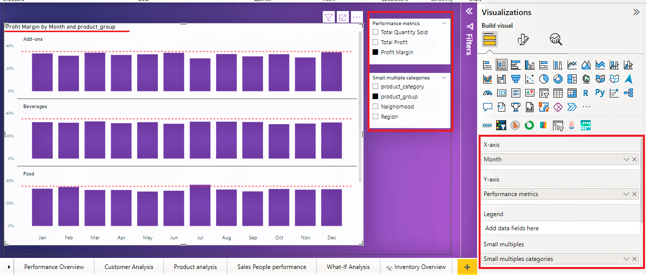
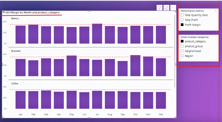
- Example 2: Use in small multiples
You can take your visuals a bit further by using your field parameters as small multiples. If you don't know what small multiples are, I wrote a blog post about using it here.
Let's take this scenario for example: you'd like to customise a small multiples visual using different performance metrics like profit, profit margin, and quantity sold. You also want to be able to change the small multiples category. You can create 2 field parameters and use one in the axis field and the second one in the small multiples field. This can be seen in the visual below
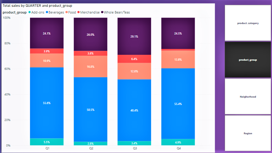
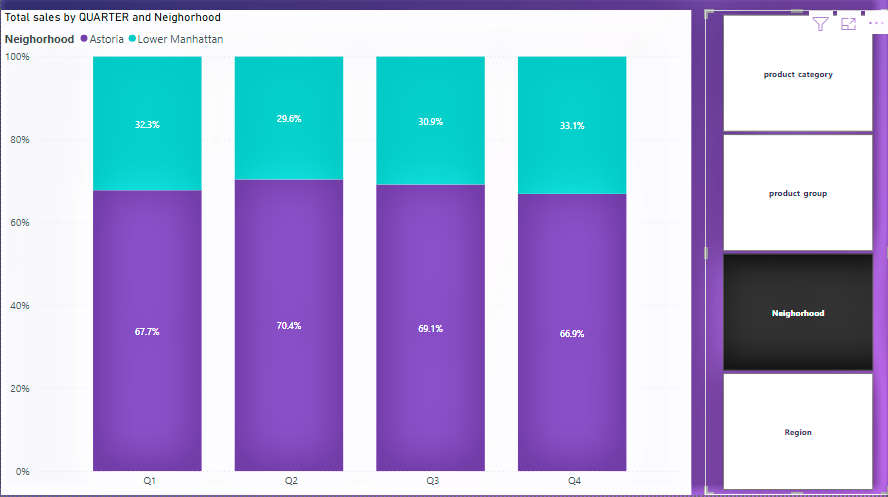
- Example 3: Use as a legend
Field parameters can also be used in the legend of your visuals so you can view the same metric across different dimensions.
Say for instance, you'd like to see how much different categories contribute to sales, this can easily be done using field parameters.
The visuals below show the % contribution of each product group to sales each quarter. The slicer on the right can be used to change the category viewed, such as neighbourhood
So what do you think? In my opinion, this is one of the best feature updates of Power BI in recent times. It saves so much time and makes creating engaging reports a lot easier.
Additional resources
If you prefer to learn by watching videos, here's a recommendation and stay glued to the Power BI blog for updates on when it becomes generally available.
Thanks for reading, please share if you found this useful and leave a comment if you have any :)


